The wonderful DNAGedcom software recently added an option to build a chart using the Collins Leeds Method (CLM). Here is a good write-up by Kitty Cooper about the nuts and bolts of the CLM.
Basically, what it does is use your list of Ancestry DNA matches and the ICW file (those matches that share other matches with you) and builds a chart showing all of this in a nice visual format.
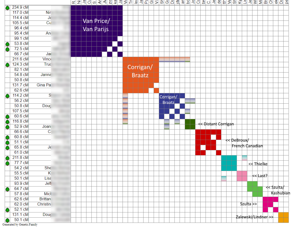
Here is my CLM chart, though I may need to update it since I’m not sure the last time I pulled data from Ancestry DNA:

As you can see, the chart puts the shared matches into groups. I’ve labeled them manually based on how I know we’re connected. The small grey boxes show that some matches also match into some of the other groups, which makes sense.
I was pretty surprised that my Van Price/Van Parijs line was the largest collection, especially since I usually have a ton of French Canadian matches, but maybe those cousins are more likely to test at Ancestry.
Sadly, not a lot on my paternal grandfather’s side, though there are some, especially in the Kashubian region of Poland. The other large sections are paternal, but on my grandmother’s Irish and German side.
I am waiting for DNAGedcom to finish a very large import and then I will run it for my mom’s Ancestry matches, but I did do a manual version of this and saw similar groupings.
If you don’t have access to DNAGedcom, since it does cost a small amount every month, you can do this yourself manually using either Excel or the free Google Sheets using the original Leeds Method by Dana Leeds.
I’d love to see if using this method opened up any doors for you. For me, it did make me wonder about some possible adoptions or non-parental events on my paternal grandmother’s side (not on my direct line, but off to the side) since some matches have some surnames, but not others and a few other odd things. So, I’m doing some more in-depth research off of those lines.


