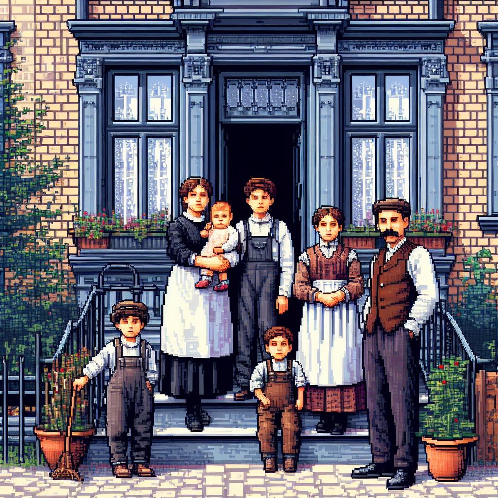
I had some inspiration yesterday on a new look for my family site. Previously, the family site design just copied this blog design (with some tweaks) to make it easier. I had an idea to show off some of the great photos I have in my collection to visitors of the site. Last night and today I put it all together and it is live now.
The main photo at the top puts the spotlight on a few pictures. Currently, there are only 3 photos rotating through that area. I will add more as I find good photos to use. The photo also includes a line of information about the photo and usually a link to get more info on the individual or family.
Then I broke the main areas of the site into three categories: People, Memories, and Explore. “People” points you to the areas that deal more with the people, such as the “Surnames” area. “Memories” points you to areas like “Photos” and “Headstones.” “Explore” takes you to areas like “Places” and “Notes” so you can just browse around.
The inside pages don’t look as nice. I need to sit down and try to figure out what exactly to do. They take most of the design, but it doesn’t work as well by itself. Plus, a lot of the areas I’d like to tweak are hard to access due to the family tree web software I use. Don’t get me wrong, he developed it very nice. It’s very easy to customize, but some small areas are hard to pinpoint.
I also tried to keep it visible to people with monitor resolutions at 1024×768 and above (the common standard) but it may go a bit over at 1024 exactly. It won’t cut off any content, but it may have a horizontal scroll bar. Anyone above 1024×768 will see it fine.
Take a look at the main page and let me know how you like it. If something looks strange, let me know.
I developed it using no HTML tables, which people should try to do. Using no tables can sometimes cause issues in older browsers. I tested it in 3 of the most recent browsers: Mozilla Firefox 3.5, Google Chrome, Internet Explorer 8. I’m pretty sure it breaks horribly in Internet Explorer 6, but I really don’t care. I know for a fact a lot of the images will look bad in IE6 since I’m using transparent PNG files, which IE6 doesn’t support, but they look wonderful in everything else. IE6 is extremely old and out-dated (2001!) and I don’t plan on spending hours trying to fix it’s problems. People using IE6 should get an alert message asking them to update their browser. I’m not sure on IE7, but I hope it works overall. I didn’t do anything drastic in the design. IE7 is pretty good, overall.
It makes me feel good. One of the few times I had inspiration and finished (most of) it that quickly.


It looks very nice! A job well done.
Great job! Setting up a TNG-based site has been on my radar for quite sometime – perhaps this is the inspiration I need!
Good way to use your family pictures! Looking good.